
Mersa Maritime — heritage without nostalgia.
Identity refresh for Mersa, a 1994-founded Abu Dhabi anchorage operator. Wordmark anchors a maritime crest, the type pairs a serif title voice with utility-grade Inter UI — heritage signaling without leaning on nostalgia.
The full document, in line.
Below is the actual delivered file — every spread, in document order. Scroll the page to read through.
MERSO
MINA ZAYED · ABU DHABI
BERTH 04 · UAE
Table of
contents.
- 01.Welcome letterp · 03
- 02.Our missionp · 04
- 03.Brand manifestop · 05
- 04.Primary logop · 06
- 05.Constructionp · 07
- 06.Clear spacep · 08
- 07.Variationsp · 09
- 08.Misusesp · 10
- 09.Primary colourp · 11
- 10.Palettep · 12
- 11.Colour ratiosp · 13
- 12.Display typep · 14
- 13.Text typep · 15
- 14.Arabic typep · 16
- 15.Photographyp · 17
- 16.Business cardp · 18
- 17.Stationeryp · 19
- 18.Operational · containerp · 20
- 19.Apparel · workwearp · 21
- 20.Socialp · 22
- 21.Websitep · 23
- 22.In the wildp · 24
- 23.Campaignp · 25
- 24.Editorialp · 26
- 25.Contactp · 27
- 26.Thank youp · 28
A letter
from Saeed.
My grandfather moved pearls in 1954 between Abu Dhabi, Bahrain and Bombay. We still run the same triangle — just in 40-foot steel boxes. The brand had to sound like that, not like Hamburg.
These pages are the instructions for carrying thirty years of freight competence without the yellow-on-blue nostalgia. Engineered as precisely as Maersk — but written in the Gulf, in Arabic first.
Heritage without nostalgia.
We move cargo on the Gulf–East Africa–India triangle our family has run since 1954. We operate fourteen trucks, one hundred twenty rotating containers and two shipping-line partners. We are not a museum. We write every manifest in Arabic before it is translated.
Six lines we work by.
- 01Precision is Arab heritage, not an import from the north.
- 02A container arrives on time or it arrives wrong. There is no third option.
- 03We are the anchorage between three markets, not a logo for one.
- 04Arabic first. Always. On the manifest and the mast.
- 05Steel, paper and crosshair — nothing decorative, everything engineered.
- 06Seventy years of trust, priced by the metric tonne.
Primary lockup.
Set in Oswald Medium at +0.08em tracking. The O carries a crosshair — a surveyor's reference, a compass, a port. The Arabic lockup sits below, never beside.
Use the primary lockup wherever the brand has room to breathe — 32mm clear on all sides, minimum.
Built on a 10 × 3 grid.
The wordmark occupies ten horizontal units, from the leading edge of the M to the trailing edge of the O. The cap-height is exactly three units — giving the mark its low, horizon-hugging posture.
The crosshair in the O is centred on the third unit from the right. Stroke weight is 10% of the cap-height. Do not redraw.
Give it air.
Minimum clear space is equal to the cap-height of the wordmark on all four sides. This is non-negotiable on steel, paper and screen.
Minimum usable size is 28mm in print, 140px on screen — below that, the crosshair collapses and the mark reads as an O, not a port.
Four colour variations.
Eight things we never do.
× Don'tSalt — the gulf-deep blue-black.
Not navy. Not corporate. A blue with the weight of deep water at dawn, mixed with a trace of ink. It carries every primary surface — steel, paper, pixel — and never apologises.
The full palette.
RGB232 · 226 · 211
PMSWarm Gray 1
RGB11 · 26 · 34
PMS539 C
RGB176 · 74 · 42
PMS7578 C
RGB90 · 104 · 112
PMS431 C
Ratios of appearance.
The palette is not a four-way split. Paper leads every surface; salt carries all type and the mark; oxide is reserved for livery and the moments that earn it; brine handles the technical register.
Treat these ratios as ballast — tip them and the ship lists.
Oswald Medium.
A narrow industrial grotesque with the posture of stencilled container type. We set it in Medium at +0.08em tracking for display, and Regular at +0.12em for structural captions.
0123456789 · & — + / @ ·
IBM Plex · everything else.
IBM Plex Sans carries reading weight across manifests, specs, body copy, navigation. IBM Plex Mono handles references, ports, timestamps. Numerals tabular, always.
Small caps tracked at +0.18em for structural labels.
Plex Arabic · bilingual.
IBM Plex Sans Arabic is our Arabic complement to Oswald. We use the Medium weight at display sizes, tracked +0.1em, and Regular for running text. Arabic is always written before the English translation.
The Arabic lockup sits below the Latin, not beside — the two scripts breathe on their own.
Steel and salt light. No staging.
Don't: beauty shots of ships, drone glamour, smiling crew, glossy corporate.
Card, front & back.
85 × 55mm, Gmund Bier 320gsm. Blind-debossed mark on the front, paper ground. Reversed back — salt ink with crosshair centred, no text. No rounded corners.
Letterhead & envelope.
A4, 100gsm uncoated paper. A single-line address in the top-right mono, a 1.5px salt rule beneath the mark. Nothing else.
The envelope is reversed — salt ground, paper wordmark — and used for manifests and sample bills of lading.
Ref: MRS-0421-08
Dear Mr. Patel,
Confirming the 40-foot high-cube booked on the MV Al Dhafra, departing Mina Zayed 04 April, arriving Mumbai 22 April. Bill of lading attached; inspection certificate to follow Monday.
With thanks, and safe passage.
MANAGING DIRECTOR
Container Yard 14 · Nhava Sheva
Mumbai · India
Container, stencilled.
Salt ground, oxide stencils, paper wordmark. 40-foot high-cube livery rule: mark at 22% from the left, crosshair at 50% vertical, four operational stencils along the bottom ten per cent.
MRS-0421-08
Website, track & trace.
- Fleet
- Corridors
- Track
- About
- Arabic
Anchorage
between three markets.
Fourteen trucks. One hundred twenty rotating containers. Two shipping-line partners. The Gulf-to-East-Africa-to-India triangle, engineered since 1954.
Book a corridor →The mark, on steel.
Mina Zayed, berth 04. Stencilled oxide on a salt container. No tagline. No opening hours. The port does the rest.
Arabic first.
Seventy years of trust.
The long format.
Come to the berth.
For freight, partnership, or a tour of Berth 04 — we are at Mina Zayed. Office hours Sunday to Thursday, 08:00–17:00.
Abu Dhabi · UAE
SHUKRAN.
Skyline Advanced Technology
Need work like this?
Tell us about your launch, your market, and your deadline. We'll come back with a plan, not a PowerPoint.
More Projects
Related Work
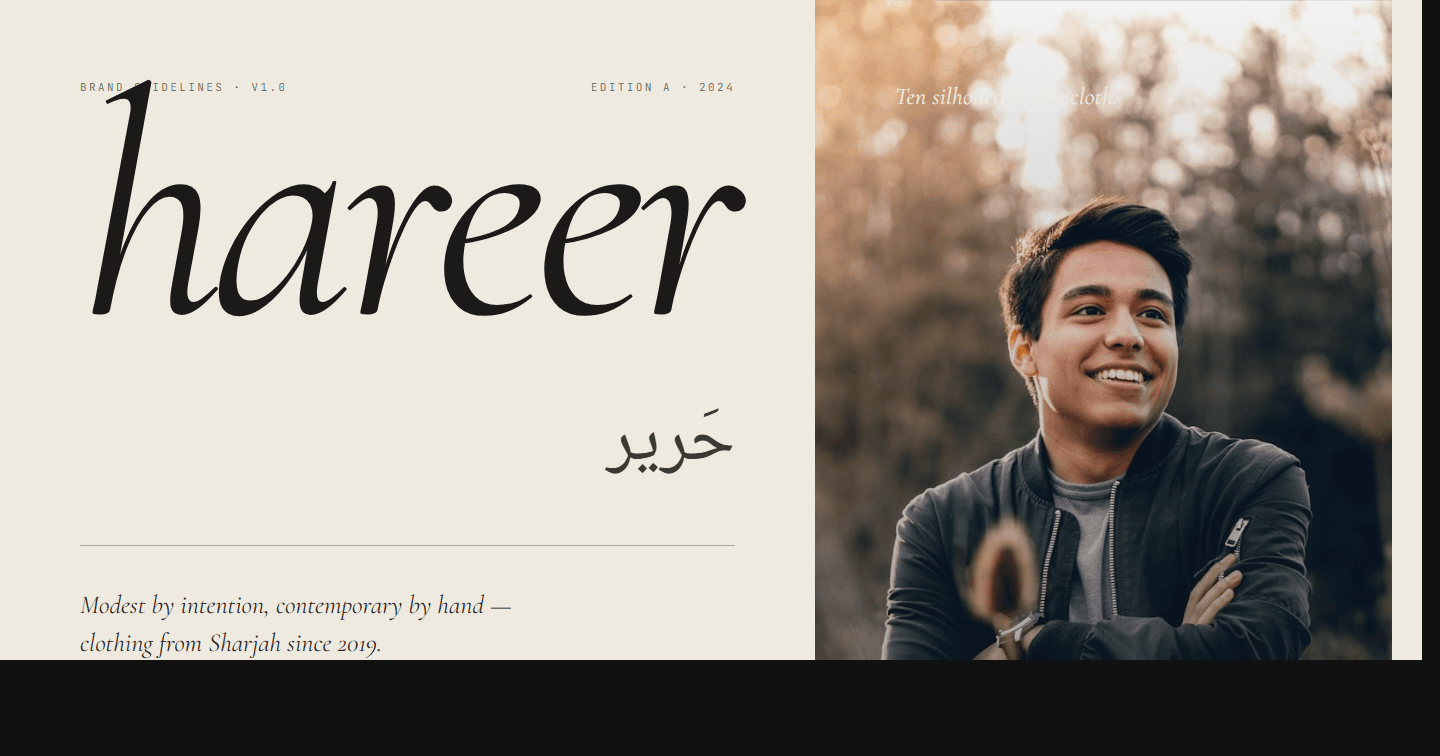
Hareer
Brand identity for Hareer — a Sharjah-based modest-clothing label. Wordmark, brand book, bilingual AR/EN voice, photo direction, and a Cormorant + Inter type system.
View project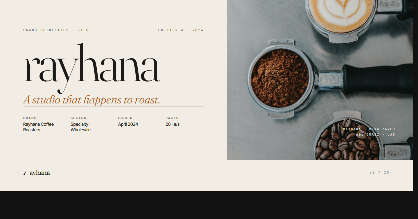
Rayhana Coffee Roasters
Brand identity for Rayhana — a specialty coffee roaster styled like an editorial studio. Hand-illustrated leaf-mark, brand book, packaging architecture, manifesto.
View project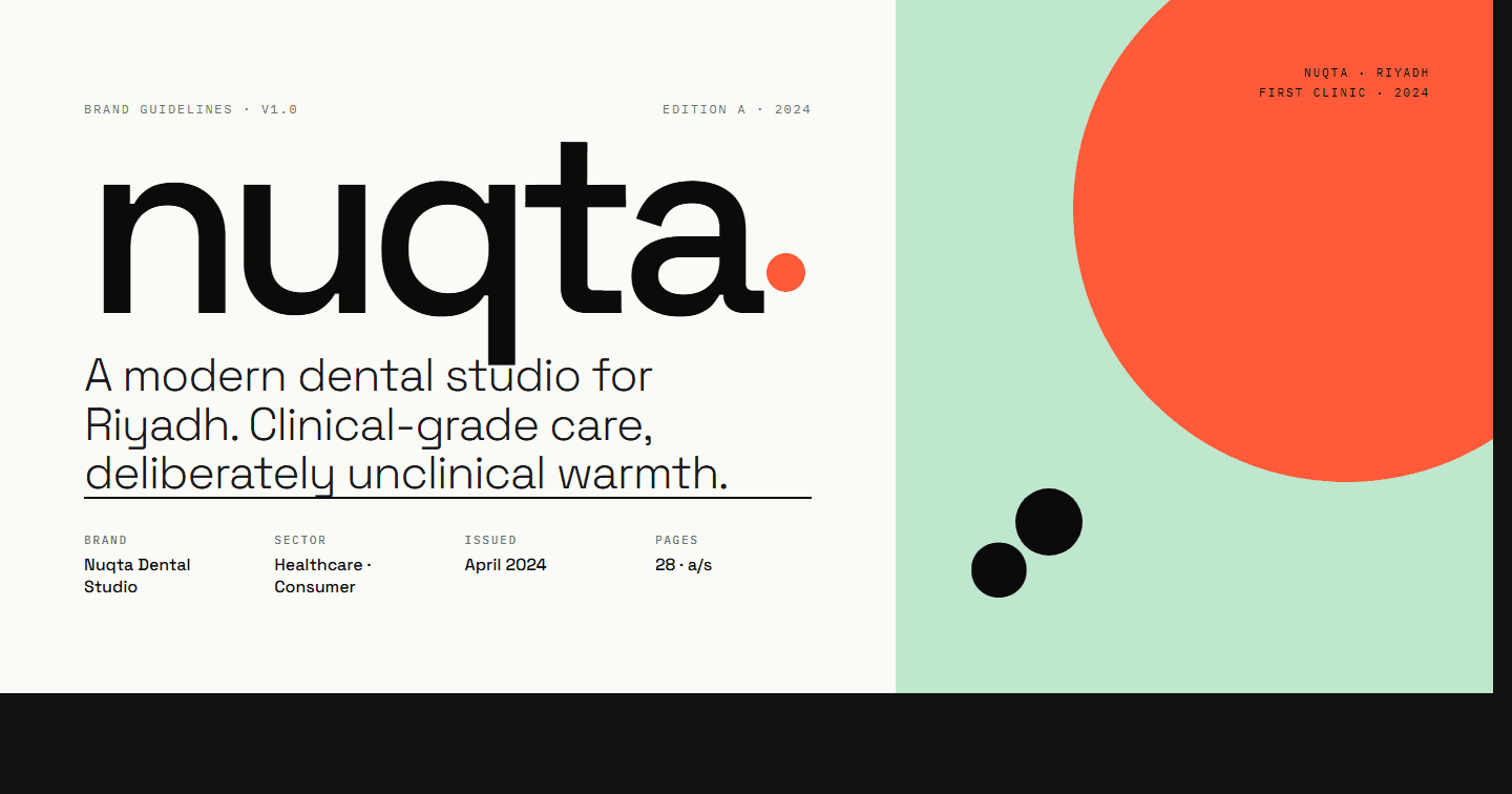
Nuqta Dental
Brand identity for Nuqta Dental — a Riyadh dental studio with the visual confidence of a design boutique. Single-dot logomark, modernist palette, and bilingual voice.
View projectHave a Similar Project?
Let us help you bring your vision to life with a tailored technology solution.